On a weekend evening, I headed to Whitefield to catch a movie with a friend. The commute was rough: heavy traffic and thick pollution made the journey feel far longer than it was. After the movie we went to grab a bite, only to find the food court packed, not a single empty table in sight.
That moment got me thinking. How overpopulated is Bangalore, really? And how does India’s population density compare to the rest of the world? In this piece I dig into that question, using data to draw out a few insights.
How populated is India?
- World population (2024): ~8.16 billion
- India population (2024): ~1.45 billion
- India’s share: 17.78%, which rounds to 18%
India is also the single most populous country, having overtaken China in April 2023.
A treemap of the top ten countries shows the shape of the distribution:
India at 17.8% and China at 17.4% are two near-equal giants.
- Together they are 35.2% of all humanity, roughly one in three people.
- The top ten countries hold 56.9%; the entire rest of the world is the remaining 43.1%.
The takeaway so far: India is enormous in raw headcount. But headcount alone is scale, not overpopulation.
Arithmetic density
Perceived, or lived, density
Arithmetic density, the total population divided by the total area, is not representative of what an individual living in that area actually perceives.
To make the point, imagine a forest of 500 square kilometres where the whole population lives in only one of them. Divide the population, say 2,000 people, by the total area and you get 2,000 / 500, or 4 persons per square kilometre. But that is not what anyone perceives. The person living there perceives 2,000 persons per square kilometre, because everyone is concentrated in a single patch. The lived figure is about 500 times the arithmetic one.
The same holds for India. India has a lot of empty patches, so its arithmetic density can be lower than countries like the Netherlands or Japan. But because the Netherlands’ population is evenly spread, the density an individual there perceives is far lower than what an individual in India perceives.
So there is little point dwelling on arithmetic density; what matters is perceived density. How do we calculate it? The formula is:
Here each patch (one square kilometre) has population and density , and is the share of the total population living in that patch.
Making sense of perceived density
Divide the land into patches of one square kilometre, and for each patch calculate its individual density, through . Then take a weighted average of these densities, weighting each by the share of the population living in that patch. This roughly translates to the density experienced by a randomly chosen individual. Equivalently, ask every person living in the area what density they experience and take the mean, and that is perceived, or lived, density.
There’s one more number worth defining, the concentration ratio . It is simply lived density divided by arithmetic density:
It tells you how much the map deceives you, how tightly a country’s people are clustered onto a small part of its land.
A note about C
A small (the Netherlands, about 7×) means people are spread evenly, so the average is honest. A large (Russia, about 620×, near-empty land with everyone packed into a few cities) means the arithmetic figure is almost meaningless. India sits at about 22×. A high isn’t automatically “bad” and shouldn’t be used to compare countries, since it measures only clustering, not whether a place is livable.
Now look at what happens when we shade the same world by lived density instead of arithmetic density.
The shift is sharpest when you track a handful of countries from one measure to the other:
Insights from lived versus arithmetic density
Arithmetic density measures the land. Lived density measures the life.
On paper, the Netherlands is denser than India, 472 people/km² to India’s 458. But arithmetic density spreads everyone evenly over all the land, including the empty parts. Measure what people actually experience and it flips: the average Indian lives at ~10,060/km², three times the Netherlands’ 3,428. The map says the Netherlands is more crowded; real life says India is.
India is one of the most densely lived large countries on Earth.
Almost everyone packed tighter is either a city-state with no countryside (for example Macao, Hong Kong, Singapore, Monaco or the Maldives, essentially one big city with no villages or farmland to dilute the average), or a near-empty country where people huddle onto a thin strip of habitable land (for example Egypt, where almost everyone lives along the Nile while the desert sits empty, or Iran, Somalia, Sudan and the Congo). Among large, fully-inhabited nations, only a handful are more densely lived than India: its neighbours Bangladesh and Pakistan, and the East-Asian density champions Taiwan and South Korea.1 For scale, the average Indian lives 5× more densely than a Finn, the citizen of the world’s happiest country, and 3 to 4× denser than the average Swede, Norwegian, New Zealander or Canadian.
So is India overpopulated? By headcount, certainly; it is the largest country on Earth. By lived density, it is genuinely among the most crowded ordinary countries anywhere. But.
But density is only part of the problem
If high lived density were the disease, the densest-lived countries should be the least livable. They are not. Several nations are packed as tightly as India, or tighter, yet offer far better conditions.
South Korea (12,565/km²) and Taiwan (13,603/km²) are both denser-lived than India (10,060/km²), yet run cleaner, better-connected, more livable cities. Israel (9,858/km²) is essentially as dense as India and far more livable. Singapore, a city-state at over 39,000/km², is among the densest places on earth and routinely ranks among the most livable. Same density, very different lived experience. So crowding itself cannot be what hurts.
There is a catch with comparing countries, though. A country is large, and none tries to make all its land equally livable. Empty mountains, deserts and farmland drag the national averages around and hide what daily life actually feels like. The honest place to compare crowding against livability is not the country, it is the city, where people actually live shoulder to shoulder.
Lived densities in world cities
To compare like with like, we computed lived density for every major city in the world, using the same population-weighted method as for countries (full method in the appendix). We kept only cities with more than 1 million people, so we are comparing real metropolises, not towns.
That leaves 520 cities across 127 countries. India alone accounts for 76, and Indian cities crowd the top of the ranking: 19 of the world’s 100 densest-lived major cities are Indian, and Mumbai is the 2nd densest-lived city on the planet, behind only Kinshasa.
Here are India’s five densest-lived cities, with the well-functioning cities that share their density band slotted in by rank2
| World rank | City | Lived density (/km²) | Country |
|---|---|---|---|
| 2 | Mumbai | 58,855 | India |
| 4 | Xiamen | 58,068 | China |
| 5 | Hong Kong | 56,895 | China |
| 15 | Bengaluru | 46,588 | India |
| 18 | Kolkata | 44,009 | India |
| 22 | Ahmedabad | 42,596 | India |
| 27 | Singapore | 38,975 | Singapore |
| 53 | New Delhi | 31,478 | India |
The point jumps out of the table. Xiamen, Hong Kong and Singapore are as densely lived as Mumbai or Bengaluru, yet they are far more livable: cleaner air, faster commutes, more open space per person. Same crowding, very different daily life.
Which raises the real question. If a city can be just as densely lived as ours and still be far more livable, then density is not the thing failing us.
Why these differ from Wikipedia's city proper list
Why these differ from Wikipedia’s “city proper” list. Wikipedia divides each city’s official population by its official administrative boundary (city proper), and every country draws that boundary differently, so that list mostly ranks who draws their city limits tightest. Ours applies one identical rule to every city and measures what the typical resident actually experiences, so it stays comparable across countries.
The full, sortable table of all 520 cities, with India’s 76 highlighted, sits in the appendix.
If density is not the devil, what is?
To find the true culprit, we picked 15 cities to study in detail, asking which measurable thing actually tracks a city’s problems. We took India’s four largest metros and eleven global cities chosen to span the full lived-density range. Only two of them, Hong Kong (56,895/km²) and Singapore (38,975/km²), are genuinely as densely lived as India’s metros, so they are our true like-for-like comparison. The rest sit lower on the density scale on purpose: spreading the cities across every density level is what lets us test whether density, or something else, drives a city’s problems.
- India’s metros (coral): Mumbai, Bengaluru, Kolkata, Delhi
- Dense and livable (cyan): Hong Kong, Singapore
- Lower-density developed (gold): Seoul, Tokyo, Paris, New York, Amsterdam, Los Angeles
- Developing cities (grey): Dhaka, Lagos, Jakarta
To understand what really drives the gap, we look at the observables, the things we can actually measure about a city. We take three:
- Traffic congestion
- Average commute time
- Air pollution
Indian cities are bad on all three, no doubt. But to understand what makes those observables bad, we look at the predictors, the things that might drive them. They fall into two camps:
-
Density: the crowd itself, measured as lived density.
-
Infrastructure per person: what the city actually gives each resident.
- Road metres per person
- Metro km per million
- Built m² per person
- Street and intersection density
So which predictor actually explains the observables? We correlate each predictor against each observable (Spearman, rank-based). The pattern is one-directional: density rises with every problem, and every infrastructure measure falls against it, usually by more.
The same story shows up if we just plot it. Take traffic congestion, the problem people feel most, and scatter it against crowding (lived density) on one side and against road space per person on the other.
vs crowding (ρ = )
vs road space per person (ρ = )
The verdict is consistent across traffic congestion, commute and air: the crowd predicts the problem weakly, and what a city builds per person predicts it strongly. Density is the setting. Infrastructure is the lever. What we feel in that Whitefield traffic is not really too many people on the land, but too little of everything that makes density livable.
The Real State: From numbers to reality
We have proven it statistically: India’s cities are not broken by their crowds, but by what was never built around those crowds. Numbers, though, keep the problem at arm’s length. This part puts the data down and looks at the real state: what the missing road, the absent train, the unbuilt floor and the unbreathable air actually do to a day in an Indian city.
We walk the same levers the data flagged, now as lived reality.
1. Roads: the half-metre city
If you have ever travelled on a road in India, you have probably felt how genuinely horrible the traffic here has become. You get stuck in jams with horns blaring on every side, people ignoring every rule of the road, bikes overtaking you from wherever they can. And if you are on the bike yourself, congratulations: the pollution alone will make you sick.
This is not just a feeling. The numbers back it up. Mumbai has 0.45 metres of road per person. Paris, just as densely lived, has 4.05 metres, nine times more road for the same crowd. And it is not only that there is too little road; the little we have is broken. Mumbai’s pothole problem is documented well enough that a newsroom went out and filmed it. This joke by Azeem is one of my favourites that explain the situation well 

And Bengaluru, I would rather not get into, but I have to. The average ten kilometres there now takes about 34 minutes to drive, putting the city among the three slowest on Earth to move through (TomTom Traffic Index, 2024). The same ten kilometres takes roughly 14 minutes in Los Angeles. Travelling across Bengaluru can feel like a slow punishment, the worst I would wish on anyone, and by the latest ranking it sits as the second most congested city in the world.
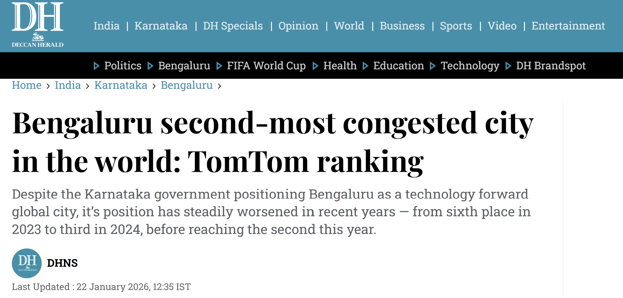
Bengaluru, ranked the world’s second most congested city. Source: Deccan Herald.
Let’s look at three road metrics, metres of road per person, vehicles per 1,000 people, and minutes to drive 10 km, across the 15 cities we picked earlier.
Road per person (m)
Vehicles per 1,000 people
Minutes to drive 10 km
We clearly see from the plots above that Indian cities consistently rank among the worst on every one of these metrics.
Personal story: A smooth ride in Singapore
I was once travelling from a friend’s place back to mine in Singapore. The two were very far apart, but as the car moved along the road, the ride was so smooth, not a single horn. The car was going at 80 km per hour, and it was a really pleasant ride. That, I think, is what differentiates Indian cities from cities abroad. I can’t tell you how bad the situation of roads and traffic is in this country. It is terribly bad.
When you count how many vehicles are crammed onto each kilometre of road, India’s metros are in a league of their own: roughly 590 vehicles per km in Bengaluru, 470 in Delhi, 440 in Mumbai, against about 70 in Singapore, 90 in New York, and under 40 in Amsterdam. We packed five to fifteen times more vehicles onto every metre of road than the cities we like to compare ourselves with. That is definitely not survivable, so we must have built some amazing mass transit to give people another way to travel, right? right?
2. Mass transit: the trains we did not build
Bengaluru’s metro is nothing but a joke. Imagine a kid drew two perpendicular lines and went back to sleep, that’s the Bengaluru metro. For a city with this much traffic, the metro is one big fucking joke.
Bengaluru has the worst mass transit system in the country: just 4.9 km of metro per million people. Compare that with 44.9 km per million in Singapore, or even 12.5 km per million in Delhi and 18.7 in Kolkata. The city that grinds to 16 km/h on its roads also gave its people almost nothing to get off those roads.
Oh Mumbai mass transit is not that bad, right, right? Mumbai’s suburban rail carries around 7 million people every single day, on a system never built to hold that many. Moreover, travelling in the Mumbai local is also dangerous. To see how it really is, watch the first few minutes of this.

I can go on with more numbers and stories, but if you are living in India you know the facts, you have lived through the experience.
One of the things that made my stays abroad memorable, whether Stockholm, Vancouver, or Singapore, was the simple ability to move around the city comfortably. I could decide at 6 PM that I wanted to be in a different part of the city, reach there easily, enjoy time with friends, and know for certain I would get home without trouble. Weekend grocery shopping on the metro, back to my doorstep, all at a fraction of the cost, just with public transport.
Here in India, meeting my friends in the same city, Bengaluru, is a whole-day chore. If I decide to use only public transport, I first have to walk to a bus stop far from my house, then stand in an overcrowded bus with no AC, driven like the driver thinks he is in GTA V. Then I squeeze into a metro so packed I can’t move my leg. Then one more bus to reach my friend’s place, and I arrive already exhausted. And the metros here close at night, so I can’t even stay late, because I always need to make it back. You can feel the difference yourself.
Compare that to an evening abroad, where I decide on a whim to catch up with a friend across the city. We meet at a beautiful lakeside, spend time together, and I come home on public transport that runs no matter the hour.
3. Built space: too little floor, not too many people
Built space is a simple idea. Take all the floor space inside a city’s buildings, every flat, room, office, shop and classroom, and divide it by the number of people. It tells you how many square metres of indoor space one person actually gets to live and work in. It is the number we feel every day but never name. It is the difference between a family of five having room to breathe and a family of five in a single room with no door to close. Low built space is where the feeling of being crowded actually comes from, not too many people on the land, but too little floor built for them.
Here is what that looks like in Mumbai: 6.6 square metres of built space per person. That is smaller than a single car parking spot. That is the average Mumbaikar’s entire share of the city’s indoor space, the home, and proportionally the office, the shop, the classroom, all of it. A Parisian gets about 38 square metres, almost six times more. A New Yorker gets nearly 50. We are not short on land for these people. We are short on the rooms we built for them.
4. The air we cannot escape
One thing that got etched into my mind: Bryan Johnson, the longevity guy, walked out of an interview with Nikhil Kamath partway through, because the air quality inside the room was so bad. In his own words:
India’s air quality is a joke on the country and its people. The WHO says a safe annual average for PM2.5, the fine particles that lodge deep in your lungs, is 5 micrograms per cubic metre. Delhi, our capital, runs at around 93. That is not a bad year or a bad week. That is the everyday number.
Delhi is the most polluted capital city in the world, and has been for years (IQAir World Air Quality Report). Not the most polluted among poor countries, not the most polluted in Asia, the most polluted capital on the entire planet. Here is what that looks like next to the cities we measure ourselves against:
A resident of Tokyo or Paris breathes air at around 10. A Delhi resident breathes air at 93, roughly ten times worse, and about eighteen times the WHO safe limit. Every single breath, every day of the year.
And Delhi is not alone, a lot of our major cities are polluted. Three of the five most polluted major cities that we have choosen (out of the 15) are Indian. Not one of the cleanest is.
Did you know? The Supreme Court has ruled that clean air is part of every Indian’s Right to Life under Article 21 of the Constitution. It is a promise on paper. We just stopped keeping it.
Maybe the other livability factors won’t kill you, but air quality will KILL you. Imagine your loved ones in Delhi. Can you digest the fact that they will lose 8.2 years of their lives just because they are breathing polluted air? So those friends, those loved ones of yours in Delhi are going to go sooner than you, all because we failed to provide clean air to those people. If this is not sad, I don’t know what is.
Pedestrian roads, signalized intersections, and right-of-way.
The ones I have discussed above are only some of the livability factors. There are many many more that aren’t exactly measurable, but I want to discuss a few that particularly bug me.
Briefly: A signalized intersection is a junction where traffic lights control who moves and when, including a signal that tells you when it’s safe to cross. Right-of-way is the rule that decides who goes first, and in a walkable city it means the pedestrian wins, so cars stop and wait for you.
India doesn’t have pedestrian roads, so if I want to walk, I have to fight for my life. I could be hit by a vehicle, slip into the open drainage hole on the side of the road, or worse, step on the garbage thrown across it.
Walking on an Indian road is stressful. You don’t know when you’ll be hit. You can’t have a peaceful walk, because it’s never peaceful to walk on one. Quite the opposite: it’s incredibly stressful.
And if you thought walking was the worst part, we haven’t even gotten to crossing yet. Remember the game “Crossy Road,” where the chicken crosses a road full of vehicles that won’t stop? Imagine a real-life version, except worse: the vehicles come from random directions, each car’s speed isn’t deterministic, and when you lose, you don’t respawn on the road. You wake up in a hospital. And the zebra crossing, the one place that’s supposed to be yours, doesn’t help. The white stripes are just paint on the road. No car slows down for them, no car stops, and crossing on a zebra crossing is exactly as dangerous as crossing anywhere else.
Now imagine the alternative: proper pedestrian roads and signalized intersections, where you can stroll along the streets and signals tell you when to cross. Even a blind person can cross safely. And don’t forget right-of-way, where the car stops for you at the crossing while you walk.
I think the discussion has been fairly heavy so far, so why dont we end on a lighter note, with a fun quiz. We have seen that density is not the real problem, but infrastructure is. So let’s see how much infrastructure India’s cities would need to be as livable as the best of the world.
The Infinity Gauntlet Challenge
Somewhere in urban India, a man has gotten hold of the Infinity Gauntlet. His plan is not to wipe out half the universe. It is something far more ambitious: to drag his city up to the livability of Amsterdam. But the Gauntlet has a catch. Every snap can only double a livability factor, or cut it in half. No fine tuning. So how many snaps does his city actually need?
Pick his city, then guess.
You get the point, we need multiple snaps to get our cities to the livability of the best. Even Thanos would stop and think twice before trying to fix our cities. And even if he did, it would take him a long time to do so.
Conclusion
I started writing this fairly long, data-driven blog to answer a rather simple question: “How fucking crowded is India?” Partly because I’d been fed up with packed metros, congested roads, and the rest of it. That led me to understand that density might not be the real devil; the infrastructure is. We haven’t built it to handle the limits.
In the thick of writing this, looking at the numbers, I realized how bad the situation really is. It’s worse than I imagined. Numbers have a way of grounding things.
Let me get real for a moment. Our country is run by politicians who probably aren’t educated enough to understand a quarter of this blog. We cut down more trees every year than we plant. Our women aren’t safe here. Our national exam papers (NEET) get leaked, and our PM won’t even comment on it. Our education minister won’t take responsibility. Our government offices are corrupt. Political parties spread communal hate to win elections. We mob-lynch journalists who speak against the ruling party. Our IT cells spread misinformation across every social media network. Our media hypes up a chocolate instead of asking real questions.
If you still think there’s hope for this country, I don’t know how else to convince you. We are rolling down a hill. If you’re educated enough to leave, doing so would be the most optimal action to take. Isn’t it?
Appendix
How lived density is calculated
The formula chops a country into 1 km² patches, finds each patch’s density, and takes a population-weighted average. We don’t draw those patches by hand: GHS-POP, the EU Joint Research Centre’s population grid, already estimates how many people live in every 1 km × 1 km cell on Earth. Since each cell is fixed at 1 km², its population is its density .
For a country we clip the grid to its borders and take the population-weighted average, where each cell counts in proportion to how many people live there:
Empty desert and mountain cells hold almost no people, so they barely count; the crowded cells where most people actually live dominate the average. That is why lived density reflects the experience of a typical resident rather than the average square kilometre of land. As a sanity check, summing over all of India’s cells reproduces its UN population to within 0.05%.
For each country we report three numbers:
| Quantity | Definition | What it answers |
|---|---|---|
| Arithmetic density | people ÷ total land area | ”What does a map show?” |
| Lived density | population-weighted cell density | ”How dense is the average person’s surroundings?” |
| Concentration ratio | lived ÷ arithmetic | ”How clustered are the people?” |
A large means people are squeezed onto a small fraction of the land (Russia 620×, Brazil 250×); a small means they’re spread evenly (Netherlands just 7×). India sits at 22×: its 458/km² on paper becomes ~10,060/km² as actually lived.
Every country’s lived density
India is denser-lived than about 85% of all countries. The table is sortable and searchable, and the last column recomputes live against whichever country you pick, India by default.
India is denser-lived than about 85% of all countries, 36th of 242.
| # | Country | Lived ▼ | Arithmetic | C | × vs India |
|---|
A few countries sit above India only for technical reasons: city-states with no countryside, or desert and conflict countries where people huddle onto a thin habitable strip. Set those aside and India stands out as one of the most densely lived ordinary countries on Earth.
Every major city’s lived density
The same method runs at the city scale. We clip the grid to each city’s urban-centre boundary (GHS-UCDB), keeping the 520 cities over 1 million people, with India’s 76 highlighted so they can be picked out at any sort order.3
520 cities over 1 million people, across 127 countries. India accounts for 0, and 19 of the world's 100 densest-lived major cities are Indian.
| # | City | Country | Pop (M) | Lived ▼ | Arithmetic | C |
|---|
Data and sources
Every chart in this piece, in the order it appears, with the online source its numbers come from. The core datasets are:
- GHS-POP, the Global Human Settlement population grid (R2023A) from the EU Joint Research Centre. All lived-density figures.
- GHS-UCDB, the Urban Centre Database (R2024A) from the EU Joint Research Centre. City boundaries, built space per person, and road length (road network from OpenStreetMap).
- UN World Population Prospects 2024. National populations.
- Natural Earth (10m admin-0). The arithmetic-density map.
- TomTom Traffic Index 2024. Congestion and driving speed.
- IQAir World Air Quality Report. PM2.5.
Transit, vehicle and commute figures come from each city’s transport authority and national statistics office (for example BMRCL, DMRC, MMRDA, MoRTH, GVB and LTA). Each figure is tagged with its specific authority and year.
Chart by chart, in the order they appear:
- PopulationTreemap (top 10 countries by population): UN World Population Prospects 2024.
- DensityMap, arithmetic (world choropleth): population from Natural Earth (POP_EST) divided by land area; 249 countries.
- DensityMap, lived (world choropleth): GHS-POP 1 km population grid (EU JRC), clipped to national borders; 242 countries.
- DensitySlope (arithmetic vs lived, selected countries): Natural Earth (arithmetic) and GHS-POP (lived), as above.
- CityLivedBars (the 15 study cities): GHS-POP 1 km grid clipped to GHS-UCDB urban-centre boundaries (EU JRC).
- CorrelationBars (predictor vs observable): Spearman correlations across the study cities, computed from the per-city metrics above.
- CityScatter (congestion vs density and vs road per person): density from GHS-POP / GHS-UCDB; congestion from the TomTom Traffic Index 2024.
- RoadsReality (road per person, vehicles per 1,000, minutes to drive 10 km): road length from GHS-UCDB R2024A (network from OpenStreetMap); registered vehicles from national and city transport departments (MoRTH and state RTOs, US/EU DMVs and stats offices); minutes to drive 10 km derived from the TomTom Traffic Index 2024.
- MetroPerMillion (metro km per million people): metro and suburban-rail route length from each city’s transit authority (BMRCL, DMRC, MMRDA, Tokyo Metro, GVB, LTA, MTR, MTA, and so on), per population.
- BuiltSpace (built m² per person): built-up area per capita from GHS-UCDB R2024A (EU JRC).
- AirQuality (5 most polluted vs 5 cleanest of the study cities): annual mean PM2.5 from the IQAir World Air Quality Report. The 10 cities shown are the top-5 and bottom-5 of our 15 study cities, not a global ranking.
- DensityTable (every country, 242 rows): GHS-POP 1 km grid (EU JRC), shown with arithmetic density (Natural Earth) and the concentration ratio.
- CityDensityTable (every major city, 520 rows): GHS-POP 1 km grid clipped to GHS-UCDB urban centres (EU JRC); 520 cities over 1 million people.
- ThanosQuiz (the Infinity Gauntlet challenge): road per person, metro per million, built space and PM2.5 for Bengaluru, Mumbai, Delhi and Amsterdam, from the same sources as the charts above.
Media: the embedded video, short and tweet cards are credited inline to their creators (Times of India, Azeem Banatwalla, Mohak Mangal, Bryan Johnson); the Bengaluru traffic image is from Deccan Herald.